
Mobile-Friendly Trip Planner
A trip planner designed for phones that shows route options, schedules and step-by-step directions between two locations.
CHAPTER 2 OF 3 — YORK REGION TRANSIT · WEBSITE
Information architecture • UX strategy • CMS • Mobile-first
CORE RESPONSIBILITIES
Ran yrt.ca as an annual program, setting priorities, scope and schedule, with a major refresh every four years.
Led journey mapping, focus groups and service-design workshops, and turned the findings into the site structure.
Customer Portal, feedback forms, Live Chat and Lost and Found, so riders get help beyond Contact Centre hours.
Kept the site to WCAG 2.0 Level AA and tested it with riders and the Accessibility Advisory Committee.
Managed the web support contract and directed the consultant, IT Services, the Contact Centre and subject matter experts.
KEY DECISIONS
The challenge
The goal
Build the site around riders’ journeys, so every task is straightforward from the first search to arrival.
DECISION 1 · NAVIGATION
The challenge: riders had to hunt for everyday information on a site organized around how YRT works, not how riders look for things.
What I decided: I held focus groups with staff, regular riders and first-time transit users, and invited the Accessibility Advisory Committee for feedback. We turned what we heard into a new sitemap and four main menus that put everyday tasks, like the Trip Planner and the Fare Chart, one click from any page.
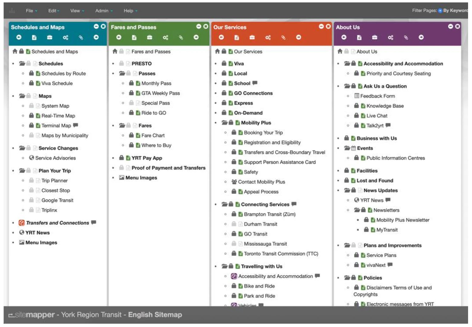
The draft sitemap we tested with the focus groups: every page, grouped under four main menus.
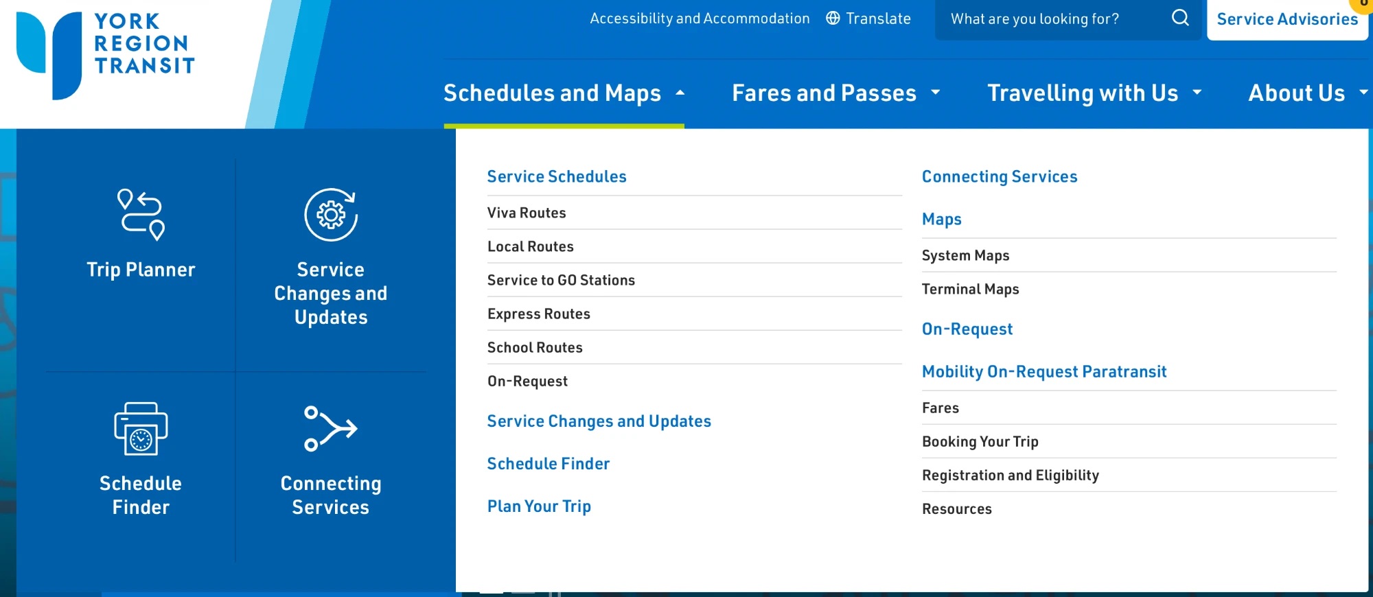
Schedules and Maps: the most-used tools up front, with routes grouped by type of service.
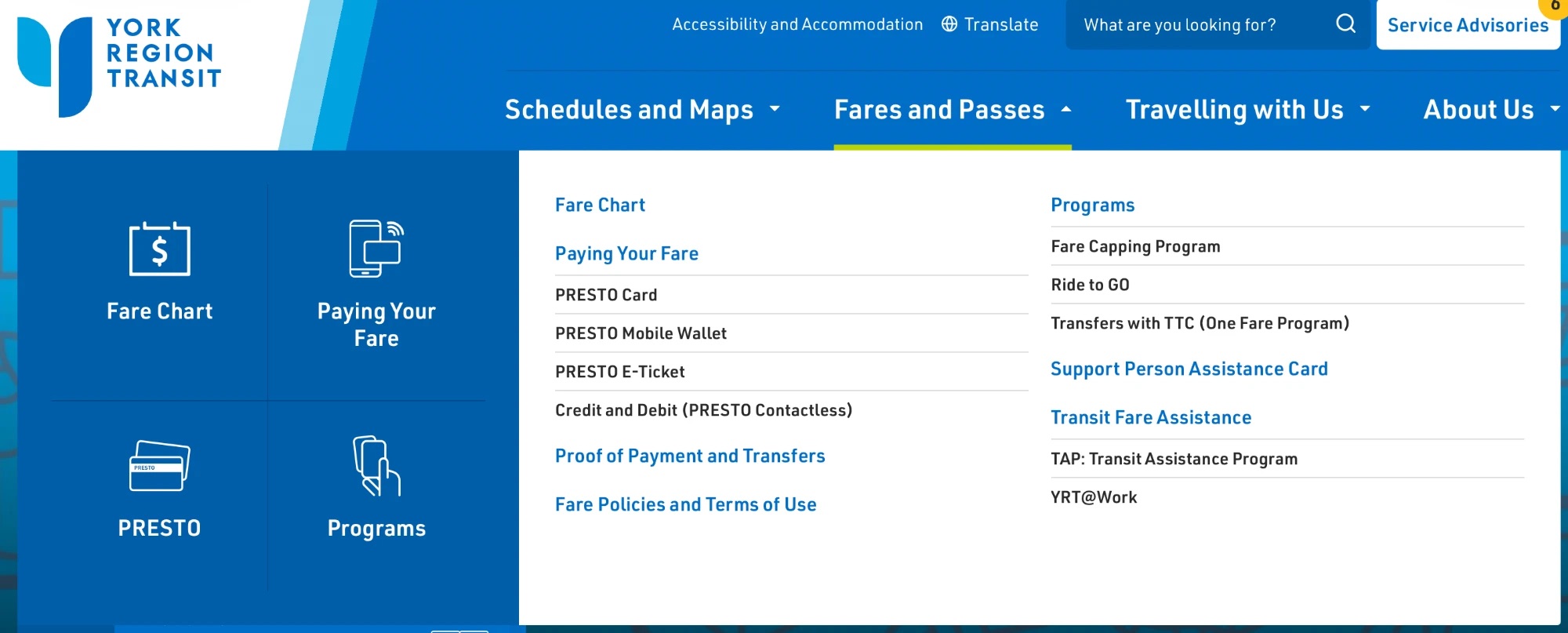
Fares and Passes: organized around how riders pay, from PRESTO to fare assistance programs.
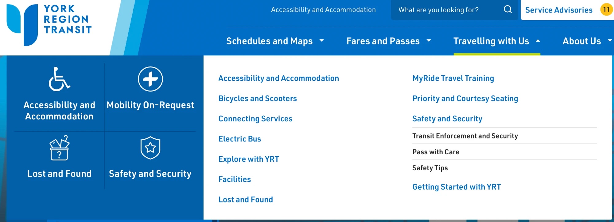
Travelling with Us: everything riders need on the trip itself, from accessibility and On-Request to safety and lost items.
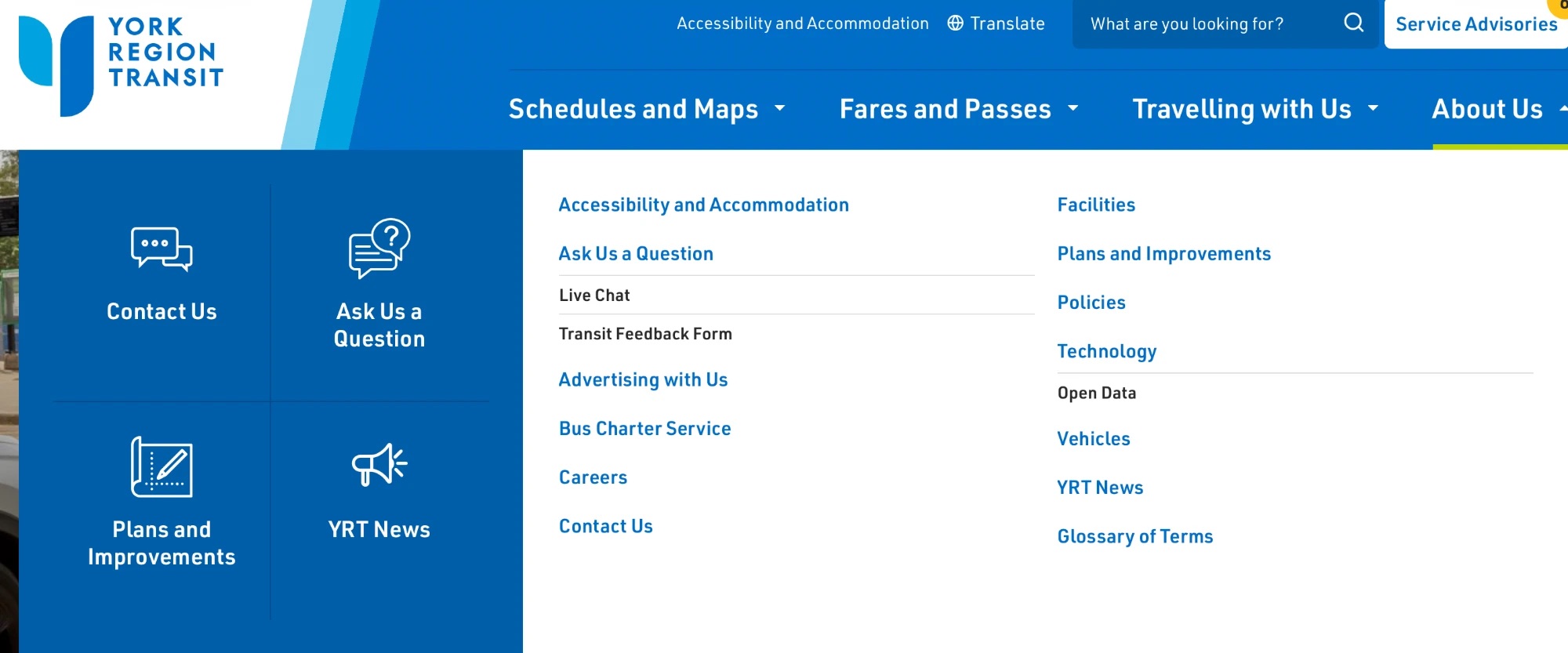
About Us: contact, feedback, plans and news brought together in one place.
DECISION 2 · WIREFRAMES
The challenge: changes made late in design and build are slow and costly, and every group needed to see the plan early.
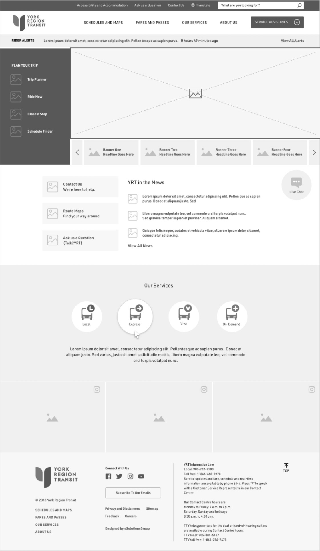
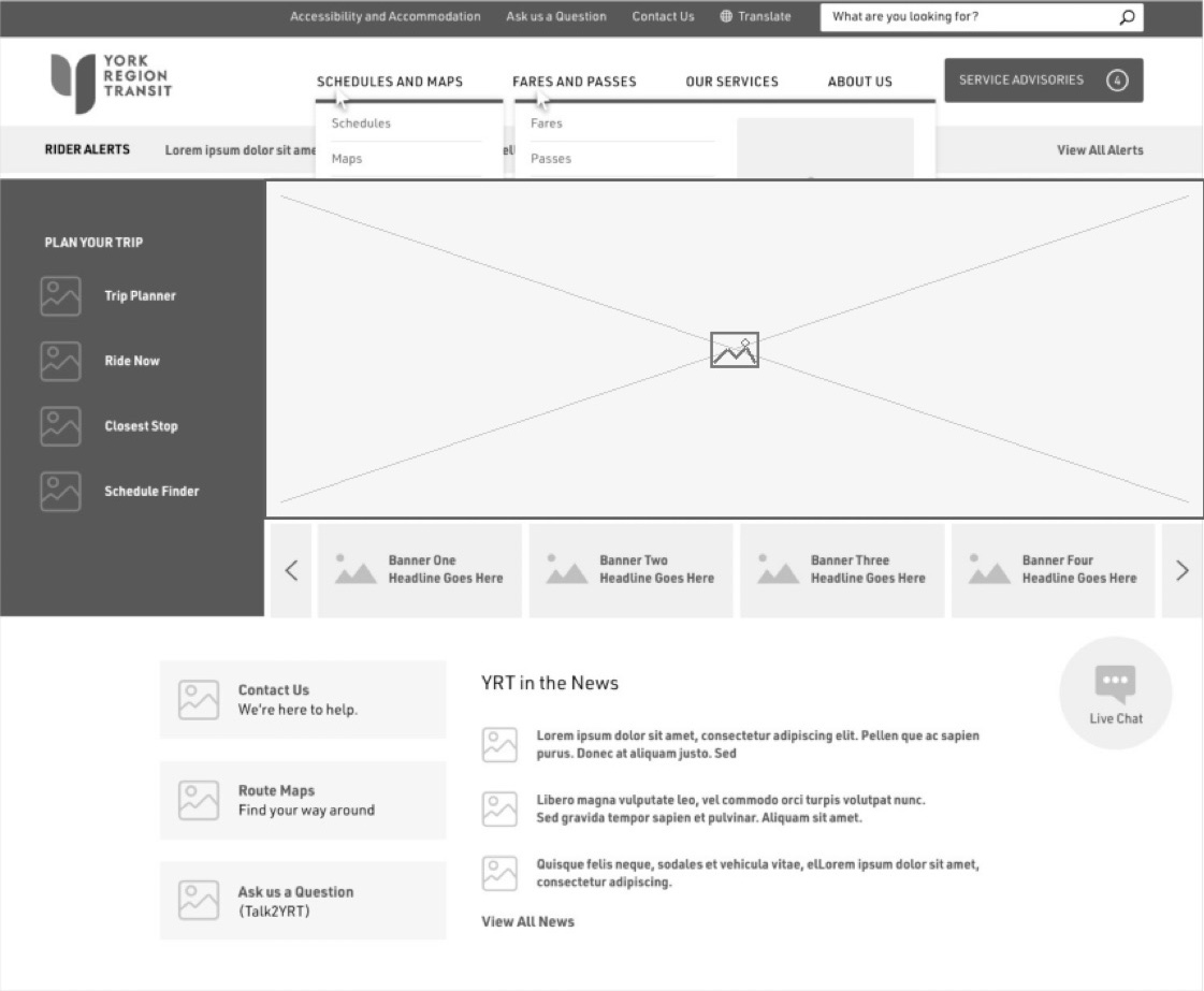
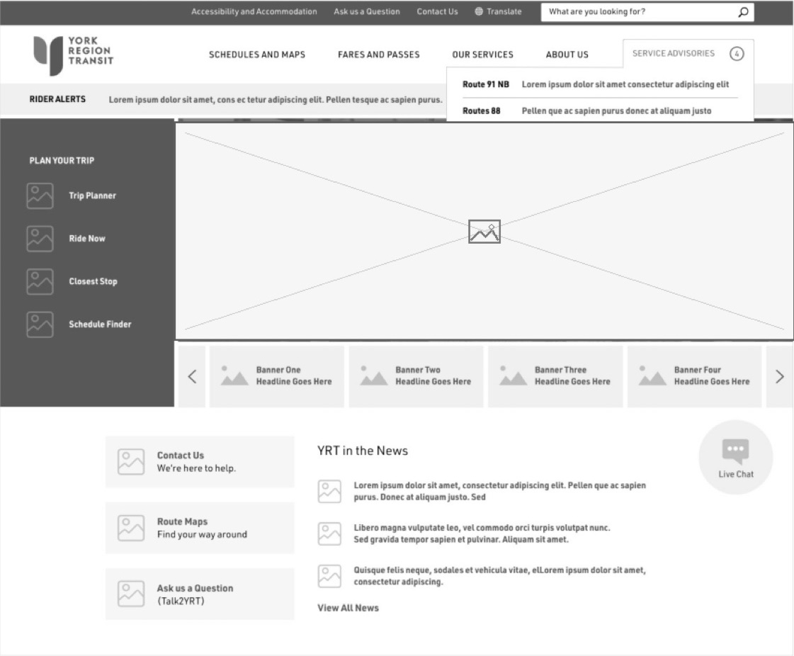
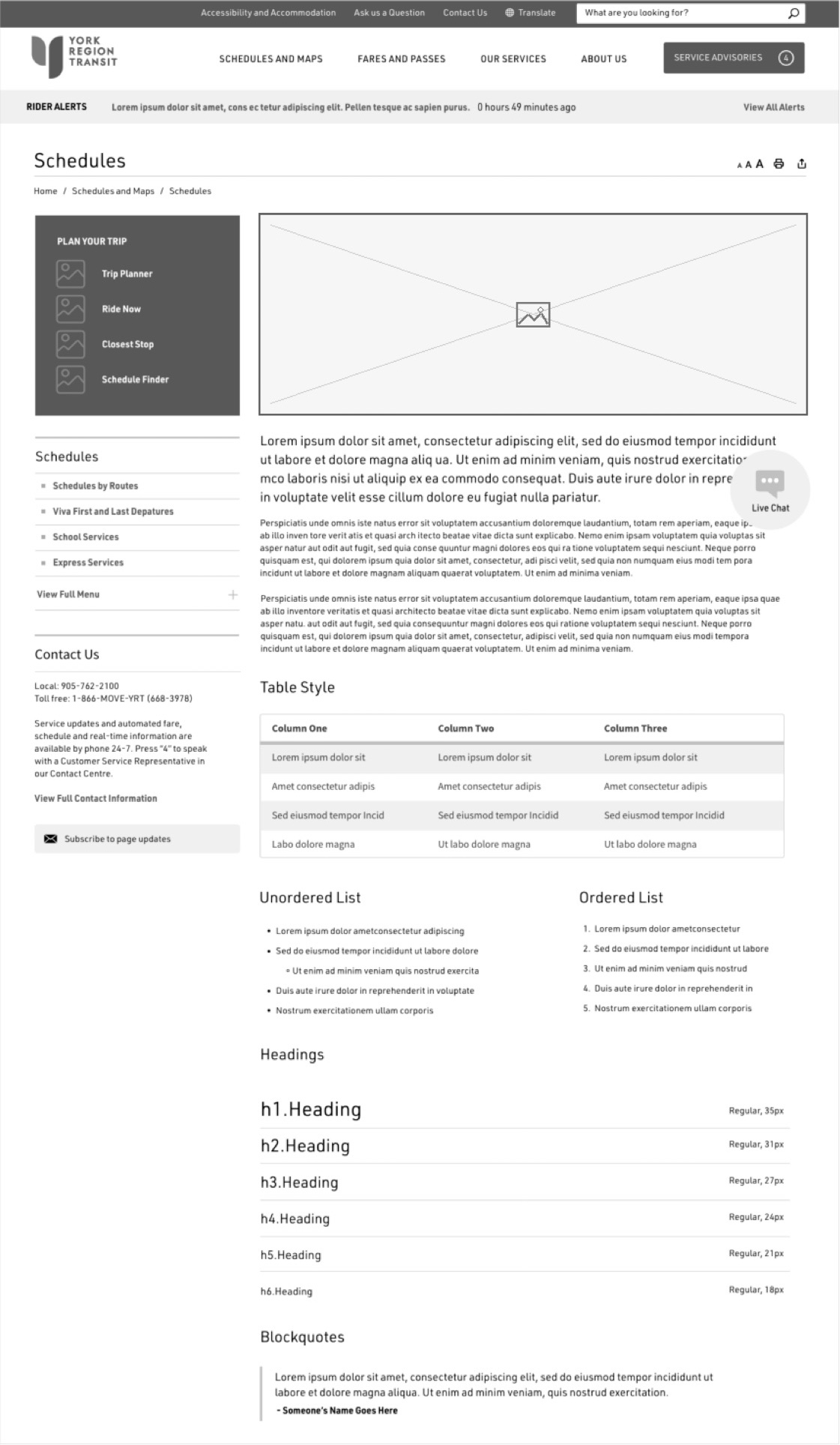
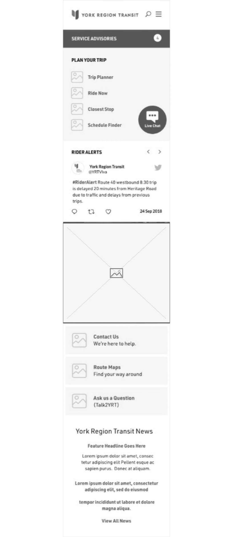
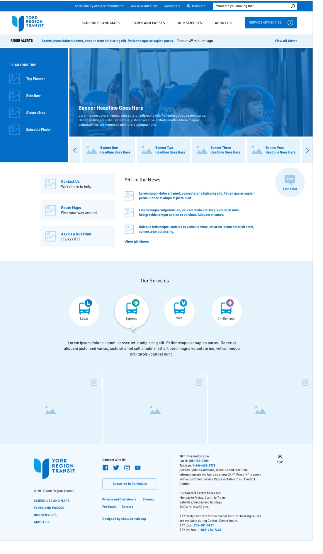
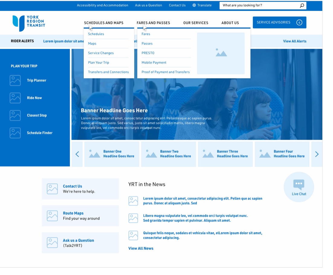
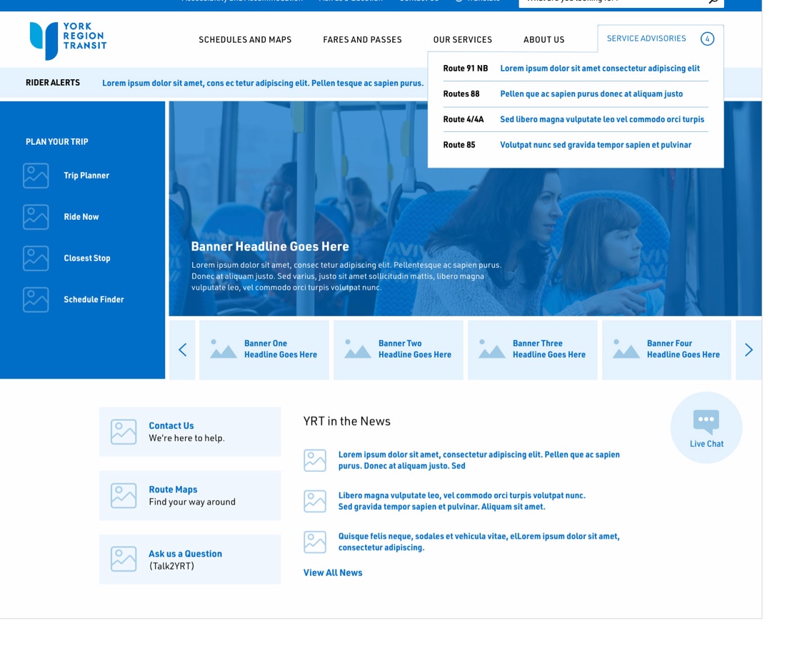
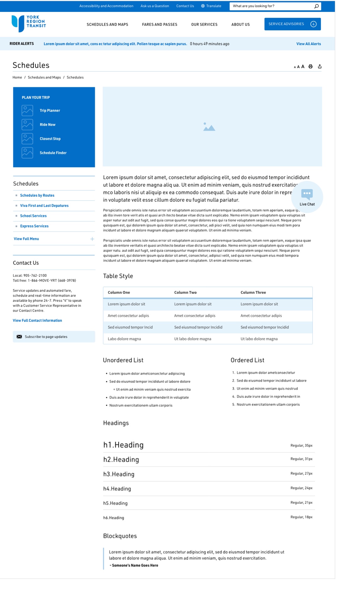
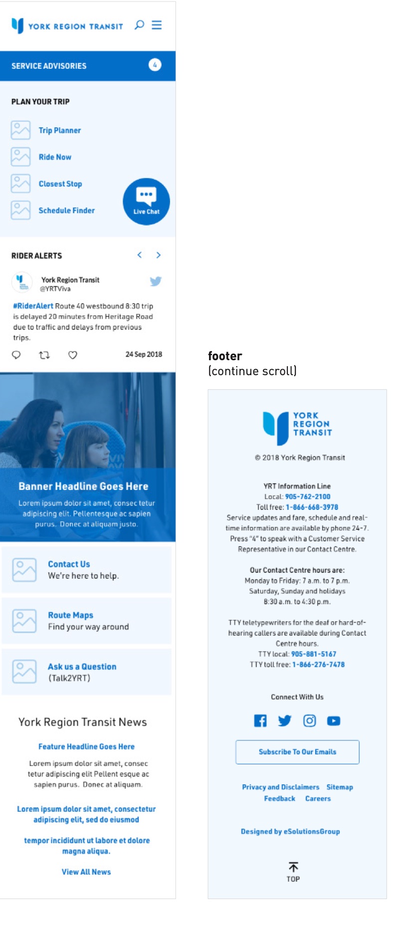
What I decided: I guided my team and directed the consultant to develop a preliminary framework, starting with low-fidelity wireframes to agree on structure, then high-fidelity wireframes to test the look, for the homepage, navigation, service-advisory dropdowns, interior pages and mobile. We reviewed each round before design and build, then carried them into the final design.
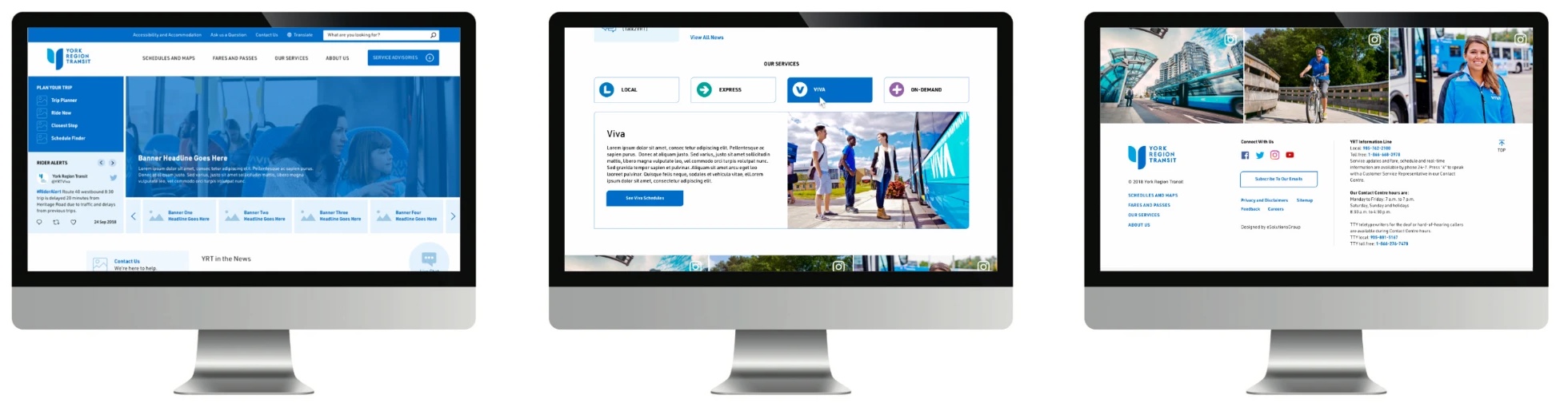
3 · The final design: the homepage, the Our Services selector and the footer.
DECISION 3 · SELF-SERVICE
The challenge: riders picked their feedback topic from a long dropdown of 16 options with internal names, which caused confusion.
What I decided: We replaced it with ten topic cards, each with an icon and keywords that help riders find the right one. The form connects to the Salesforce CRM Customer Portal, which my team and I mapped so riders reach five self-service tools from one landing page: service requests, request tracking, the knowledge base, the neighbourhood map and transit feedback.
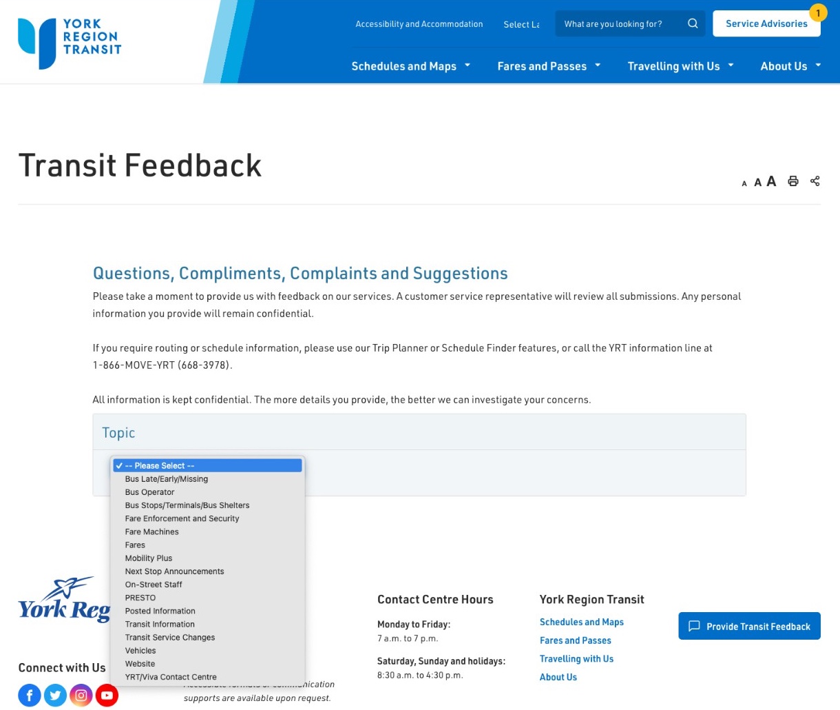
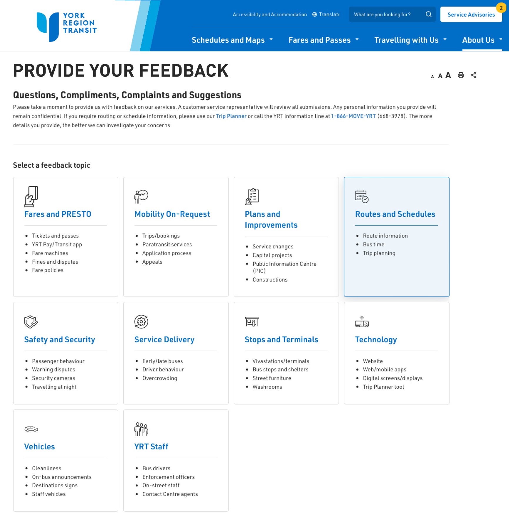
Before: internal topic names in one dropdown, hidden until opened. After: every topic visible, with keywords that help riders find the right one.
DECISION 4 · TRIP PLANNING
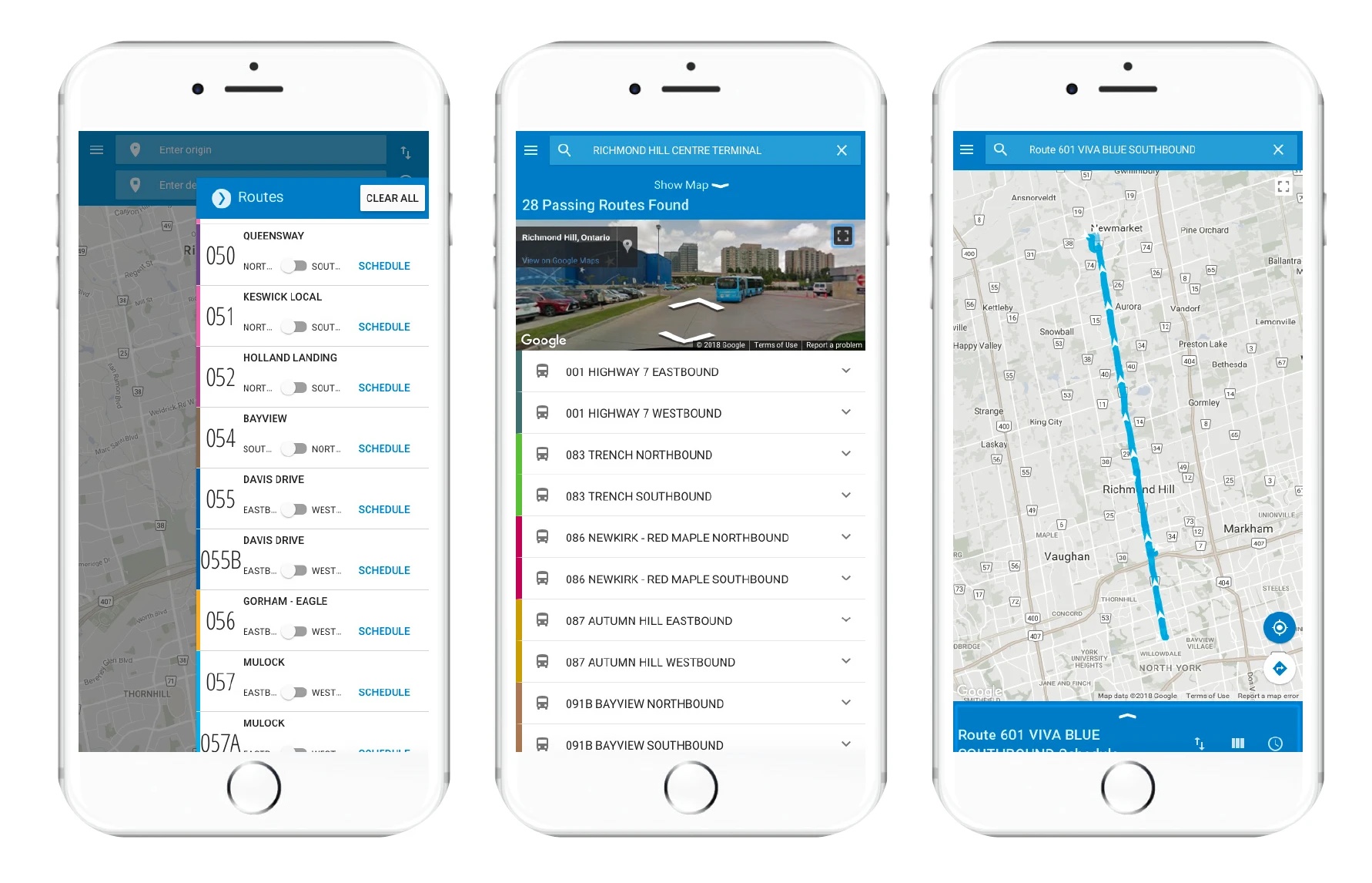
The challenge: the old trip planning tools weren’t built for phones, where most riders plan their trips.
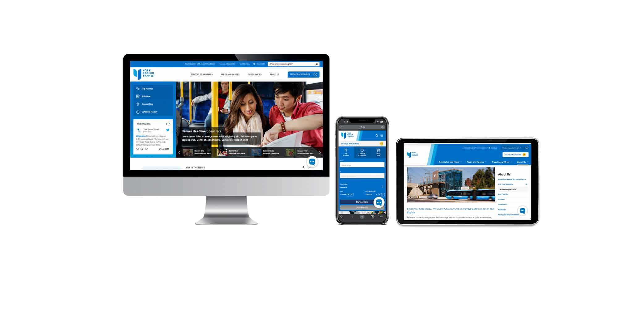
What I decided: My team and I worked with our technology partners to replace them with a responsive trip planner and a new trip-planning widget on the yrt.ca homepage, so a rider’s next bus is a tap away on any device.
DECISION 5 · USER TESTING
The challenge: launching first and fixing problems afterward would leave riders to find the issues, and if the site didn’t work the way it should, we would lose their trust.
What I decided: I built testing into the schedule and tied development, content and communications to it, staying agile so we could adjust as feedback came in. We recruited riders by email, invited the Accessibility Advisory Committee to test the site, and fixed what they found before launch.
THE OUTCOME
A trip planner designed for phones that shows route options, schedules and step-by-step directions between two locations.

Live bus locations and predicted arrival times for each stop, along with notices of service changes and disruptions.

An online chat on yrt.ca that connects riders with a customer service agent for questions about trips, fares and service.

An online form where riders submit comments, suggestions and complaints about YRT service.

An online form for reporting items left on a bus or at a terminal, and searching for items that have been turned in.
In 2020 the redesign won an Award of Excellence at the APEX Awards. The refresh brought a modernized design, a smooth move to a new cloud CMS and WCAG 2.0 Level AA accessibility (99% compliant). Riders now find everyday tasks one click from any page, choose from ten plain-language feedback topics instead of 16 confusing ones, and can reach Live Chat beyond Contact Centre hours. I’ve kept improving the site as an annual program, with technology and design upgrades every year and a major refresh every four years.
